Airbnb Landscape Redesign
This project explores how the Airbnb iOS experience could adapt to landscape mode as part of a design exercise in responsive layout exploration. The design task was to reimagine how Airbnb’s interface, hierarchy, and interactions could evolve when rotated horizontally. The goal was to preserve Airbnb’s visual identity while enhancing usability within a wider aspect ratio.
Listing Page
With the listing page, I wanted to explore how a wider aspect ratio could make choosing accommodation easier by displaying more information at once. The landscape layout lets users browse photos while reading key details, creating a more seamless and intuitive comparison experience. It also introduces a more social aspect, perfect for showing listings to someone or planning a trip together on a shared screen.
Improved Map View
The search page in landscape mode focuses on improving the map experience and overall usability. The wider layout gives the map more room to breathe, making it easier to explore areas, compare prices, and understand the geography at a glance. By allowing users to view and interact with the map and listings simultaneously, it reduces back-and-forth switching between screens and offers smoother, more intuitive navigation. This setup provides better usability compared to the regular portrait layout, ideal for visual explorers and those planning trips together.
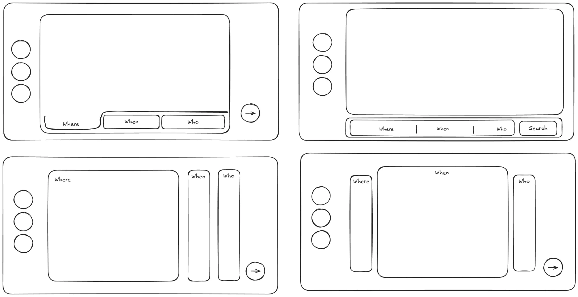
Search Experience
Simple wireframing allowed me to visually explore the search UI in landscape mode. I focused on maintaining intuitive usability while adapting the layout for a wider aspect ratio. It was important to preserve the flexibility of the search experience, enabling users to search for stays without needing to specify exact dates or locations.
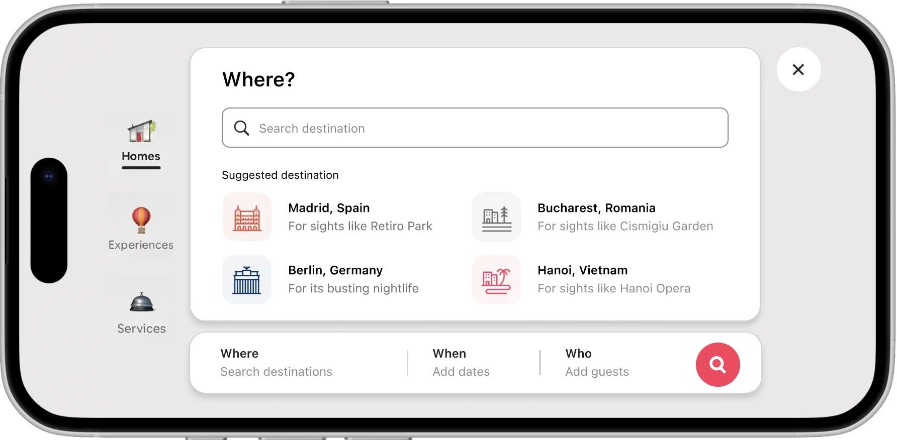
Where
The screen is based on a portrait layout, adapted for landscape mode, allowing users to easily search for destinations and browse suggested locations. The clean and intuitive layout ensures a smooth experience, enabling users to quickly explore destinations.
When
The date selection screen, originally designed for portrait mode, was reimagined for landscape, providing an interactive calendar that allows users to select exact dates or flexible options. This design maintains flexibility while improving the overall flow and usability in a wider layout.

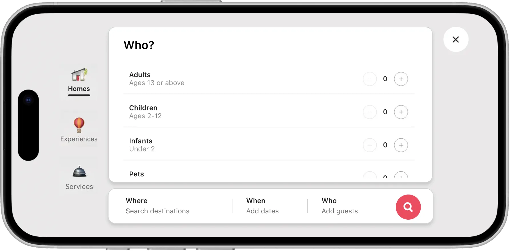
Who
The next screen allows users to specify the number of guests for their stay. The simple interface, originally based on a portrait layout, adapts seamlessly to landscape mode, providing easy access to modify guest details without interrupting the flow of the search process.